Masterpieces of The Museum of Modern Art NYC
For any art lover, the Museum of Modern Art (MoMA) in New York City is a must visit. Throughout the year, MoMA presents many incredible exhibits showcasing modern and contemporary artists and their inspiring works. But MoMA’s permanent collection is perhaps the most impressive collection of modern art in the world. Located on the 4th and 5th floor, the collection will appeal to all visitors. I have so many favorites it as hard to pick a top ten!
First, a little history. The Museum of Modern Art in New York City was created in the 1920s by three influential woman and patrons of the arts: Miss Lillie Bliss, Mrs. Mary Quinn Sullivan, and Abby Aldrich Rockefeller. In New York society, the women were known as “the daring ladies.” They wanted to create a museum dedicated to modern art that challenged the conservative and traditional thinking of moat museums. They felt it was important for people to see, understand and enjoy modern art. They struggled however, with this question “How can there be a museum for modern art?” A museum’s mission is to house history which is the opposite of modern art which deals with the idea of change and moving forward. Even today MoMA grapples with this but presents not only one of the best permanent collections but also some of the most cutting edge, modern artist and exhibitions today.
The museum was such a success that by 1939 it had moved spaces three times. In 1939, the Museum moved to midtown Manhattan in the space it currently occupies. At the moment, MoMA is undergoing a building expansion which will increase its gallery space by 50,000 square feet. When the museum opened, its first gift consisted of 1 drawing and 8 paintings. Today, the collection consists of 200,000 workings that include drawings, paintings, photographs, sculptures, media, and films. The mission of MoMA in its early days was to have art come and go. It wasn’t until 1952 that the first permanent collection was established with very diverse, avant-garde pieces. Today the permanent collection consists of many masterpieces. I’ve picked some of my favorites to share with you. There are countless works to discuss and some of the more famous works (that I love) are not on view. However, the list I have complied is a wonderful sample of this incredible modern collection. Follow the gallery order and you breeze through the collection.
Starry Night, Vincent Van Gogh, 1889 (Gallery 1, 5th Floor)
Starry Night
Perhaps the most famous work at MoMA is Van Gogh’s Starry Night. No matter when you enter this gallery there is always a crowd in front of this painting! But it is worth the wait to view it up close. Van Gogh was a Dutch, post-impressionist painter. Incredibly this master was self-taught. Van Gogh painted Starry Night in mid-June 1889 when he was living in an asylum in Saint-Remy-de-Provence. In 1888, Van Gogh had a breakdown; it was at this time that he cut off his ear. He admitted himself into the asylum which was housed in a former monastery. His time in the asylum was one of his most prolific painting periods.
Starry Night is an eastern view form the window of Van Gogh’s asylum room. Van Gogh based the image on his imagination, memory and emotion. It is the only night version of the 21 versions of the view he painted. The image also includes an idealized town. No town really existed in the view. The steeple of the church reflects the style of church architecture in Van Gogh’s native Netherlands. There are several other inaccuracies in the painting. Van Gogh omitted the bars that were affixed to the asylum windows and the moon is portrayed incorrectly. Experts believe that the bright star featured on the right is actually the planet Venus. Records indicate that in 1889 Venus was visible in Provence. There is much debate on the use of the Cypress tree. This has long been a symbol of death but it is unclear if that is what Van Gogh was alluding too.
It’s hard not to gaze at the painting and be struck by the thick, sweeping brushstrokes. I am always memorized by them. These brushstrokes create a turbulent, swirling pattern almost like waves in the ocean. Van Gogh actually considered this painting a failure because it was too abstract. He actually didn’t offer it up for sale for a long time because of this. Starry Night is the perfect starting point for a tour of MoMA!
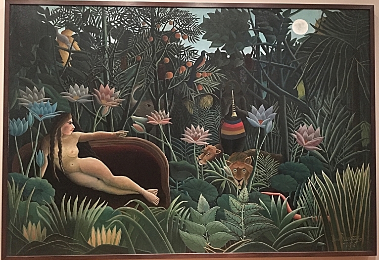
The Dream, Henri Rousseau, 1910, Gallery 1, 5th Floor
The Dream
There is something about this painting that has always intrigued me. It is actually located to the right of Starry Night. Since Starry Night always has a crowd, turn your gaze to look at The Dream while you wait. Rousseau was a French painter who actually never left France. Like Van Gogh, he was also self-taught. During his life, he created a series of 25 jungle paintings. The animals were based on illustrations in his daughter’s picture books as well as popular literature. The plants were based on tropical plants from the Paris Conservatory and Botanical Gardens. Botanist today have been able to identify each plant in his works.
Rousseau, however, took these realistic images and created a dreamlike state. The lush scene is created by enlarging the plants making them longer, fuller, more perfectly formed. Rousseau loved the color green and often used 22 shades of it. Rousseau adds a nude woman reclining on a sofa to the scene. She is pointing to the lion and a hidden snake charmer playing the flute. She could possibly be his Polish mistress from years ago. Her images alludes to the classical tradition of the reclining nude. One interpretation of the painting is that she is dreaming she is listening to a flute player and this is the image of her dream.
Rousseau actually wrote a poem to explain the meaning of the painting:
Yadwigha in a beautiful dream
Having fallen gently to sleep
Heard the sounds of a reed instrument
Played by a well-intentioned [snake] charmer.
As the moon reflected
On the rivers [or flowers], the verdant trees,
The wild snakes lend an ear
To the joyous tunes of the instrument.
Les Demoiselles d’Avignon, Pablo Picasso, 1907 (Gallery 2, 5th Floor)
Les Demoiselles d'Avignon
Picasso’s Les Demoiselles d’Avignon (Woman of Avignon) is perhaps THE most famous example of Cubism. Picasso abandons all traditional ideas such as composition, natural depiction of the body and perspective to creative this large work. The five women are portrayed distorted and in geometric forms yet staring directly at us; they have a looming presence. This was the premise of Cubism: the use of geometric plans, compressed space, and abstract, flattened subjects. When Picasso completed this work (in 9 months after countless sketches), it was considered revolutionary yet incredibly controversial.
The painting depicts five prostitutes on a street from a brothel in Barcelona, Spain. Picasso had originally named it Le Bordel d’Avignon but it was renamed by an art critic during its first exhibition in 1916. The public were horrified by the work considering it highly immoral. The controversy regarded not just the subject matter but also the lack of naturalism in the female figures. Even their faces are distorted. The faces illustrate the influence of African and Iberian masks on Picasso’s work. The two women on the right have faces reflecting the look of African masks while the three on the left have the look more of Iberian masks. Every time I stand in front of this work, I feel as though the women are staring right at me with powerful glances. Picasso’s masterpiece is a must stop.
Unique Forms of Continuity in Space, Umberto Boccioni, 1913, Cast 1931 (Gallery 3, 5th Floor)
Walking into Gallery 3, this dynamic, bronze sculpture greets you. Boccioni’s sculpture is a true force to take in. Make sure to walk fully around the piece. Boccioni was an Italian Futurist. Futurism emphasized speed, technology, violence, and the industrial city. Futurists wanted art to be dynamic and full of energy. Unique Forms of Continuity in Space captures all of that! It actually looks like the wind created it. I am always amazed that Boccioni could sculpture this! I can almost feel the wind blowing through the gallery while I look at it. This marching figure with no arms or face appears to be moving. The figure was actually based on the image of a football player moving after catching the ball. The feet sit on thick blocks of bronze acting as the sculpture’s pedestal. Many feel that the body resembles the ancient sculpture of the Winged Victory while its polished bronze metal refers to modern machinery. Ironically, Boccioni created the cast for this sculpture in plaster. He never saw the bronze sculpture which was cast in 1931 after his death.
Dance I, Henri Matisse, 1909 (Gallery 6, 5th Floor)
Matisse's Dance I is one of his most famous works. This large painting features a group of woman giving off a feeling of joy and energy. Personally, Matisse’s Dance I is one of my favorites. The painting was actually a study done for a pair of canvases called “The Dance and Music” commissioned for a Russian merchant, Sergei Shchukin. The works were intended to decorate a spiral staircase in Trubetskoy Palace, his Moscow mansion. The Dance canvas was to be hung on one of the landings.
Dance I
Matisse’s painting was very daring in different ways than Picasso’s Les Demoiselles. The bodies of these women are very simple, flat, and similar in size. There is no perspective in this work. Yet Matisse is still able to create a sense of the movement of the dance of pure joy and pleasure. The figure on the left is rooted to the ground and much larger beginning the movement while the other bodies seem to float continuing the movement. The lowest figure appears to be leaning in to continue the dance. The landscape is indistinguishable but the colors help in giving off this feeling of joy.
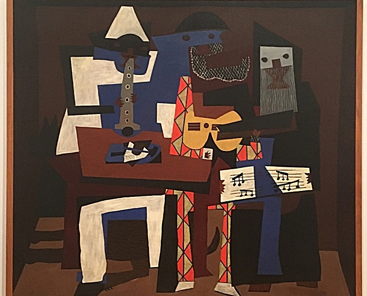
Three Musicians, Pablo Picasso, 1921 (Gallery 7, 5th Floor)
Three Musicians
Picasso painted this large painting, Three Musicians, during the height of Synthetic Cubism. In this type of painting, the artist creates the subjects by using a series of planes, lines, arcs, and shapes. He takes the shapes of the subjects and distorts them. We, the viewer, are expected to examine the shapes and reimagine them to decide what they represent. The artist and viewer work together to understand the work.
I love this work. There is something so intriguing about it to me. The musicians are presented in bright colors with angular shapes. Picasso was also very interested in the characters of the Italian Commedia dell Arte. His musicians represent a character as well as a real person. In the middle, the guitar player is depicted as the Harlequin (or funny servant). This figure also represents Picasso himself. The clarinet player on his left portrayed as Pierrot (the sad clown) and represents a poet friend of Picasso’s, Guillaume Apollinaire. He had just died from the Spanish Flu. The singer holding sheet music on the right portrayed as a monk represents Picasso’s friend, Max Jacob; he joined a monastery shortly after this work.
Each of the figures appears to blend in to each other. Picasso achieves this with the use of flat shapes that almost appear to be a cut and paste collage. The musicians sit in a room with flat walls and a flat ceiling which seem crooked. Yet the men are steady. The distorted images, the bright colors, the abstract shapes, and flat patterns make this painting super intriguing.
Waterlilies, Claude Monet, 1914-1926 (Gallery 9, 5th Floor)
Water Lilies are Monet’s most famous works known throughout the world. Waterlilies exemplify the ideals of the Impressionist movement: loose and light brushstrokes and palettes, painting outside, and capture a moment of time or “impression.” The effect is always mesmerizes me!
Monet used the water lilies and sky as the subject for over 250 oil paintings. They were the subject of all of the works made in the last decade of his life while suffering from cataracts. Monet even planted the water lilies (that became his subject) at his home in Giverny, France. Each panel was “to create an illusion of endless water without the horizon or bank.” The colors all mix together. Monet liked to explore one subject in a series but looking at the subject at various times of day, with different weather, and different light. His objective was for us, the viewer, to become lost in a work rather than just looking at it. The canvases are very large- 6 FT x 41 FT. He was very specific in how he wanted them to be hung. Each panel was to be hung in a room with no edges or corners thus creating a space like water in a pond. MoMa recreates this perfectly.
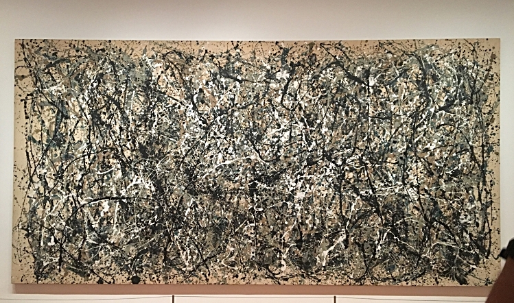
One: Number 31, Jackson Pollock, 1950 (Gallery 12, 5th Floor)
One: Number 31
So, your first thought when standing in front of this work might be – This looks like something I could do! But Jackson Pollock’s One: Number 31 is a true reflection of Pollock’s genius and innovation. This painting is an example of Abstract Expressionism which Pollock created by using the “drip technique.” This large-scale work covers 150 square feet (9 FT x 17 ½ FT) and was painted entirely with the large canvas stretched on the floor. Pollock turned an old barn on the East End of Long Island, New York into his studio in order to have be able to stretch out the canvases. He then took thick paint and poured, dribbled, and splattered it onto the canvas sometimes with brushes and sometimes straight from the can. Try to get as close to the painting as you can; it’s amazing to see how thick the paint really is! Pollock literally used his body outstretched to reach different parts of the canvas. He said that by doing this he felt closer to his work. The liquid paint balanced by the puddles and spatter of paint allows Pollock to create a painting full of energy and tension with no focal point.
Pollock was heavily influenced by the jazz music of Charlie Parker and Miles Davis. He felt that jazz music put him in a trance which allowed him to work and move according to the music’s rhythm. He would drip and splatter the paint according to this rhythm. Pollock didn't name the painting but entitled it a number instead. He felt that by giving the painting a number rather than a name is was an unbiased title. He wanted people to look at the work for what is was and no more- just as a painting. I love sitting in front of the work. My eye wanders throughout the whole canvas; I can imagine Pollock with his jazz music playing as he worked!
Flag, Jasper John, 1954-1955 (Gallery 13, 5th Floor)
Flag
Many people will look at this work and say, “So, it’s an American Flag!” I thought that at first too. But then I investigated. Jasper Johns chose this subject since it was something “the mind knows” already. Johns created Flag when he was 24 and had been discharged from the army two years prior. He was inspired by a dream he had had of the American flag. During 1954, the flag appeared in the news often due to various political events. Interestingly, Johns had been named for Sergeant William Jasper who had saved the flag at Fort Moultrie in the American Revolutionary War.For Johns, however, this work was not just about the American flag. Instead, it’s also about its creation. Johns used three canvases mounted on plywood and covered them with strips of newspaper and encaustic paint. This type of paint is a mixture of pigment and molten wax. It is what causes the lumps and smears that are visible if you get up close to the work. The topic and the emphasis on its creation caused critics at the time to wonder “Is this a painted flag or a painting of a flag?” Either way, its interesting to examine!
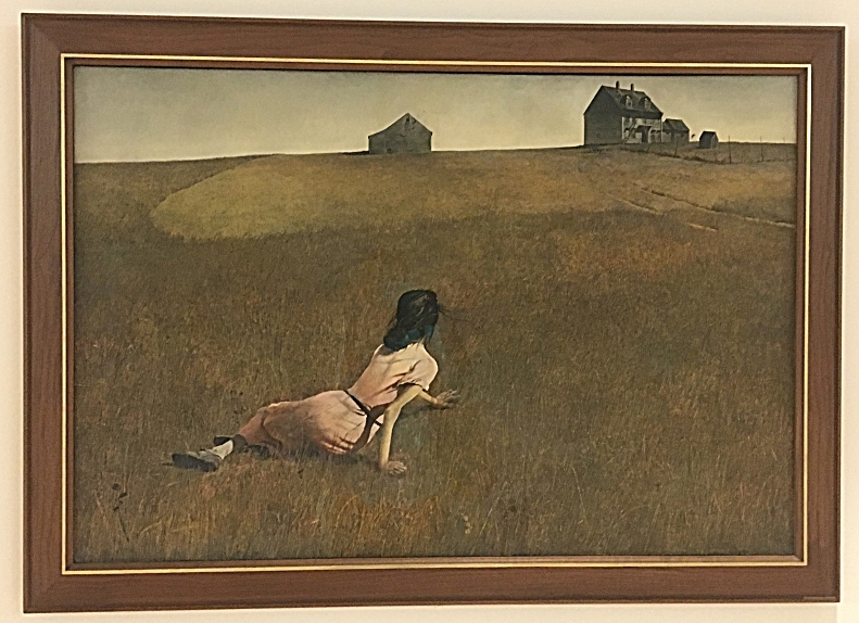
Christina's World
Christina’s World, Andrew Wyeth, 1948 (Lobby, 5th Floor)
Wyeth’s Christina’s World is one of the best known 20th century American paintings. I am a big fan of Wyeth and truly love this painting. Wyeth and his wife, Betsy, often visited Betsy’s family who lived in South Cushing, Maine. Anna Christina Olsen was the family’s neighbor in Maine. Anna had suffered from a debilitating illness in her early 30s. As a result, she had lost movement from the waist down. Anna refused to use a wheelchair and crawled everywhere. Despite her physical limitations, Anna was strong spiritually and determined. Wyeth set out to capture Anna and her spirit in his painting.
Prior to completing the work, Wyeth’s father had died. Some think his palette and barren landscapes reflect his grief. He painted the work in the style of realism: an everyday scene that has a sense of mystery. This mystery is created by his depiction of Christina. We don’t see her face but we see her messy hair, her sitting on the ground and her dress. He gives us a realistic view of the setting through a detailed depiction of the bare landscape, the rural house, and the grass. But what I always find incredible is how this work makes me ask myself questions- why is she on ground, who is she, where is she going, why don't we see her face? This farmhouse still exists today and has become a National Historic Landmark in Maine. I am always so inspired by this work and how Wyeth captured the sense of determination and the tenacity of a person’s spirit in the face of adversity and limitation. Critics often note that Wyeth was very focused on a realistic view of Christina yet he used his young wife (who was 30 years younger than Christina) as a model for the woman. Regardless, Wyeth captures this spirit of determination despite adversity in this masterpiece.
This is only a small selection of the many, many incredible works MoMA offers. Modern art can seem a bit scary, bizarre or confusing when first looking at it. Hopefully by following these notes, Modern art will become intriguing and captivating as you navigate the galleries of MoMA. Enjoy the tour!


